PRODUCT REVIEW / 14 OCTOBER 2026 / ALPHA 02
Make the factory feel like a game.
This review compares the deployed first alpha with Cookie Clicker's live browser game, then records the implemented redesign and the remaining product gaps. The conclusion: the first version had the layout of a dashboard, while the core activity required a compact, persistent game screen.
What was wrong, and what changed
| Problem in alpha 01 | Reference observation / reasoning | Implemented in alpha 02 |
|---|---|---|
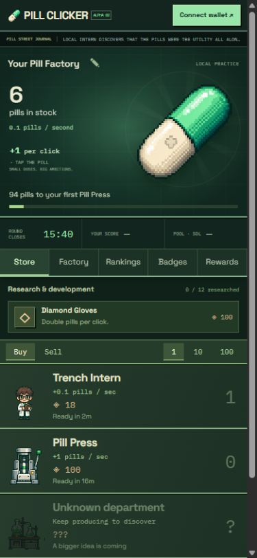
| Headers, status cards and decorative copy displaced the primary action. | Cookie Clicker's resource total and clickable sit together in a persistent column. The store remains immediately accessible. | Three contiguous desktop columns: click and stock; factory / competition; store. No page-level marketing hero. On mobile, pill, counter and first purchase fit into the opening screen. |
| Twenty store entries, including sixteen repetitive locked placeholders. | The original reveals the economy in stages. A small number of next targets makes progression legible. | Two initial departments; expansion reveals the next tiers. Unknown departments have silhouettes. Locked research is hidden until relevant. |
| Purchases changed numbers but barely changed the scene. | The first Cursor becomes visible around the cookie. Progress has a physical representation. | Each owned department adds a production floor. Employees / machines appear as purchases accumulate, with counts for larger inventories. Floors respond to selling too. |
| One primitive hero SVG, five repeated unit icons and Unicode badges. | The original uses distinct materials, object silhouettes, tactile framing and many individual assets. | Original pixel-art workshop, capsule, 20 unit sprites and 20 achievement medallions. Shared pine / teal / ivory / mint palette. No Cookie Clicker art reused. |
| Research lived below a long page; all twelve items were presented at once. | Upgrades belong near spending decisions. They should create choices rather than a wall of disabled controls. | Research is above the store. Unavailable future research is progressively disclosed; bought research leaves the purchase list. |
| Store showed base output and vague sale refunds. | A purchase needs a clear cost and benefit. | Actual marginal production includes current upgrades and buffs; bulk quantity updates cost and output. Sales show their calculated refund and lost production. Missing pills / passive wait estimates explain affordability. |
| Timed rendering replaced every store button, potentially breaking focus. | Controls should remain stable during repeated input. | DOM reconciliation updates text and attributes while retaining matching nodes. Factory scenes update only when their markup changes. |
| Fictional rivals made the competition look populated. | A leaderboard is a product state, not decoration. | Removed seeded opponents. The unconfigured competition shows an honest empty state. The round clock and score stay visible. |
Mobile evidence
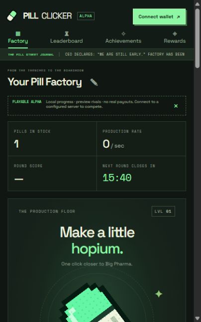
The old deployed page, observed at a 419 × 672 viewport, placed the capsule at y≈562 and the first store row at y≈1067. In the new opening state at 390 × 844, the capsule begins at y≈109 and the entire first store row ends at y≈650. These are separate measured viewport sizes, not a controlled same-size benchmark. Both 390 × 844 and 375 × 667 layouts were inspected; no horizontal document overflow was observed in the measured 390px view.
The loop to preserve
Click → buy → see the factory grow → produce faster → discover a new choice. Orteil's handbook describes distinct clickables, buildings, upgrades and achievements, visibility / unlock rules, and Cookie Clicker's 115% price multiplier. It also emphasizes descriptive flavor and pictures. The lesson is to connect systems and presentation, rather than substitute names in an otherwise generic dashboard. Orteil's handbook.
For Pill Clicker, the short loop is a capsule and the next affordable unit; the medium loop is departments and research; the long loop is patents, collections and new systems. The competitive loop sits alongside these: verified active production contributes to a 30-minute round. Spending inventory should never erase earned round score.
What the redesign does not solve
- Full mechanical parity: the alpha has twenty production tiers, twelve upgrades, twenty achievements, one timed buff and a simple patent reset. It does not yet recreate the original's breadth of upgrade chains, mini-games, seasonal events, prestige tree or late-game transformations. The blueprint proposes themed equivalents; these remain implementation work.
- Actual competition: the deployed build is still local practice until the shared database and origin configuration are connected. Wallet authentication and server-scoring code exist, but a real multi-wallet production test has not been completed.
- Reward distribution: a clock is not settlement. Token, fee allocation, confirmed funding, payout service and accounting are still required. No real reward pool or payments are displayed as active.
- Incumbent advantage: persistent exponential production combined with raw 30-minute production scores heavily favors older factories. Before prize launch, simulate new and established cohorts and choose an explicit competition policy. Resetting scores alone does not reset production advantage. Do not silently change the requested proportional-payout rule.
- Human identity and cheating: a wallet signature proves wallet control, not unique humanity. Multi-wallet farming, automation, precision at extreme balances and scale remain release concerns.
- Art production: the generated sprite sheets are distinct static illustrations with lightweight CSS motion, not a complete hand-animated character pipeline. The scenic workshop establishes the setting; the production floors reflect actual ownership.
Pump.fun adaptation
The existing theme uses the capsule, trenches, conviction, graduation and absurd pharmaceutical scale. Badge labels are adaptations, with Pill Clicker's own unlock rules. Exact current pump.fun badge thresholds are not established by this review; the public profile fetched during this pass did not expose badge labels in its text response. The game should never present its invented thresholds as official pump.fun requirements. Public profile checked.
Validation
- Clean browser start: 15 real button clicks → first intern → 0.1 pills/second → visible production floor.
- Existing local save survived the redesign. Pill Press purchase added 1 pill/second; Diamond Gloves changed clicks to +2.
- Desktop 1280 × 800, mobile 390 × 844 and 375 × 667 inspected in-browser. Factory, store and badge navigation exercised.
- Sixteen existing automated engine, authentication, scoring and proportional-allocation tests pass. They are not a substitute for real wallet or real payment tests.
Skills and sources
Used the available imagegen skill for original asset generation, and browser inspection for interaction / visual verification. No additional plugin installation was needed. Assets were generated as separate workshop, hero capsule, early unit atlas, late unit atlas and badge atlas, then integrated into the actual game.
- Cookie Clicker — live original: opening gameplay and interface observed directly.
- Orteil — Idle Game Maker Handbook: price scaling, unlock visibility, system categories and presentation guidance. This is author guidance, not documentation of every current Cookie Clicker rule.
- Pill Clicker game and technical blueprint: existing architecture, system mapping and unfinished scope.